Web Design
I designed my first website when I opened my eCommerce brand, Mona Monet. I used Shopify and designed it in a few days.
Since then I have designed some other sites, including this website that you’re on now, and my wedding website, which I sued to plan and coordinate a 57-person, 2-week, 4-city international event in Colombia.
I used Content Management systems such as Shopify, Wix, and Squarespace to build these sites, and Figma to create some of the design aspects for them. I optimize and test these sites using tools such as Hotjar and User Testing, and I produce all the content -photo, video, and written – myself.
See below to check out the websites.
eCommerce: Mona Monet
Mona Monet, the brand
Our brazen roots have taken us to 6 of the 7 continents, where we have seen first-hand how the beautiful women of these different cultures look and feel their best, and we have taken something from each one. Our style is inspired by our lives as haute bohemians, our eternal identity as citizens of the world, the places we have been, and where we still want to go.
The aesthetic is bold, simple, and elegant – with an undertone of edginess and authenticity.
I built the entire website on Shopify and did usability tests through UserTesting.com.
Everything is mobile-optimized and all images and videos on the website are from our photoshoots, which I directed and produced.
*We have since closed the website so I have provided some visualization and mapping, below.
The Homepage: Catching Your Eye & Contact Info
First-time visitors receive a 20% off first-time purchase popup, in exchange for their email address. The banner on the top shows that our customers can receive free shipping if they purchase $75 or more, and there is a feedback button on the right. Once the popup is exited out of, a 5-image carousel rotates with our new arrivals, each linking to a collection landing page.
Scroll to the right to see the carousel.
Collections
A common theme that our subjects noted during user testing is that they liked some of the items we were selling but didn’t know how to style them or where to wear them. In response to this, we created collection landing pages to help customers shop by price point (Deals Under $25), theme (Fall for Fall), or style (matching sets). This gave users a richer shopping experience, as well as up- and cross-selling to them, as they could easily find inspiration and outfits, or “looks,” rather than just single items.
Mona Monet Blogs
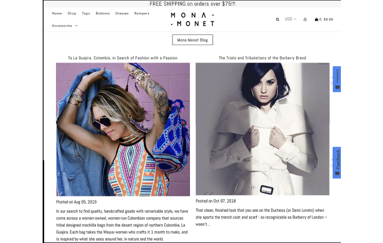
I wrote a weekly blog for the dual purpose of gaining SEO traction, and also to make the website more interactive. Content for the blogs was fashion-oriented, as well as interesting and timely, but always based on SEO search opportunities found using SEMrush. We looked for sweet spots that were being searched but were not impacted. Each blog was posted on the website and then repurposed and syndicated across all channels, including via a canonical link on Medium.
(please note that, because we have closed down MonaMonet.com, these blogs now live on Medium)

Events: wedding website
I’m getting married in a 2-week, 4-city event in Colombia in March 2023. There are 57 people attending the wedding and 43 people are attending the honeymoon in New Orleans directly after.
In order to disseminate the information for the trip, collect opt-ins, and address questions for a group this size I decided to create a website (actually it’s a landing page on my website portfolio that you’re on right now). The content strategy is to inspire and inform – while at the same time selling the trip.
Because who doesn’t want 57 people at their destination wedding?
The challenge was maintaining a perfect balance between ensuring that everyone had all the information they need to prepare for the trip, and keeping everything as succinct as possible so as not to overwhelm the guests and discourage them from using the website.
In the end, using this website as a CMS for the trip and having all the information in one place made planning my wedding a breeze.
